The Ultimate Guide to Meta Ad Specs & Design (2025 Edition): Meta Safe Zones, Formats, CTA Buttons & Best Practices
August 13, 2025
Do you also spend hours designing a stunning Meta Ad?
The ad with the perfect photo, clean text, and a bold, eye-catching CTA for Meta ad?
And then… BOOM.

Meta slaps a bunch of buttons and overlays right on top of it — covering your carefully placed CTA and visuals for ads.
All those design efforts? Wasted.
Let’s be honest — creating Meta ads can feel like playing design Jenga.
One wrong move, and... Your logo is hidden, your text gets cut off, and your message disappears under the "Shop Now" button.
If that’s the case, then don’t worry. We have heard you. The safe zone is the life saver here! The Meta safe zone is the area in your ad where important stuff (like text, logos, or CTAs) won’t get covered by Meta’s buttons or overlays.
Design inside it — or risk having your message lost behind the UI.
Therefore, after all the research and getting to the real results, we’ve filtered the exact sizes of different types of Meta Ads for you so you can design smarter, avoid clutter, and place your CTA for Meta Ads exactly where it gets seen.
Creating high-converting Meta ads isn’t just about flashy visuals. It’s about designing with intention. Every image must account for how Meta's UI interacts with your ad: where buttons appear, where text gets clipped, and how your audience views your creativity across devices.
This guide will show you the exact image sizes, Meta safe zones, Meta CTA placement, and design tips you need to make scroll-stopping ads — the kind that actually get clicks (and results)
Let’s cover it all, one by one! But first, let’s know about the safe zone trap.
Even if your ad looks perfect in Canva or Photoshop, Meta might slap a “Shop Now” button right over your call-to-action. Or block your logo with the like/share bar so here’s the best way to fit it all.
Image ads might look clean in your design file — but once they’re live, Meta’s buttons, icons, and overlays can get in the way. To keep your visuals sharp and your message clear, you’ll need to design with safe zones in mind.
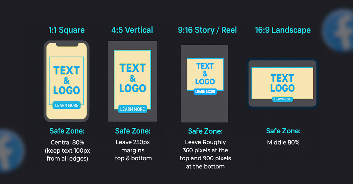
This is your best bet for Facebook and Instagram feed ads. You can include your logo and CTA — just be careful where you place them.
Leave 180 pixels at the top and bottom free of any text or logos. Why? Because Meta’s interface might cover them with buttons or reactions.
This size is for full-screen vertical ads — great for Instagram Stories, Reels, and Facebook Stories. Again, you’re safe to use logos and CTAs, but placement is everything.
Leave roughly 360 pixels at the top and 900 pixels at the bottom free of any text, logos, or design elements. This prevents interference from usernames, CTAs, or swipe-up prompts.
This ensures your message, logo, and CTA stay visible, not buried under Meta’s UI.
Meta Safe Text Zone Guide
Meta creatives vary in layout depending on where they appear. To keep your text visible and unclipped, stick to these limits:
Desktop & Right Column
Stories & Reels
These limits ensure your text stays inside the safe zone and never overlaps with Meta’s UI.
This format is often used for blog promos, article previews, or sidebar ads. It’s simpler and doesn’t include a logo or Meta CTA — so keep the design clean and message short.
· Meta ad images should be saved as JPG or PNG files.
· The maximum size of the file should be 1MB.
· Since most people view ads on their phones, always design with mobile in mind — use large fonts, strong contrast, and make sure the main message stands out clearly, even on small screens.
Video ads grab attention fast — but only if they’re designed right. Just like image ads, you’ll need to leave space for Meta’s buttons and overlays, so your message doesn’t get blocked.
This size works best for video ads that show up in Facebook and Instagram feeds. You can use logos and CTAs, but placement is key.
Leave about 180 pixels at the top and bottom free of any text or design elements. That space is often covered by Meta’s like, comment, and share buttons.
Recommended length: Anywhere from 59 seconds to 3 minutes.
This full-screen vertical format is perfect for Instagram Reels, Stories, and Facebook Stories. It’s fast, punchy, and made for mobile — but you have even less space to work with.
Leave roughly 360 pixels at the top and 900 pixels at the bottom of your video clear from text or branding to avoid overlapping CTAs and usernames.
Ideal length: 14 seconds — short and scroll-stopping.
Safe Text Zone Guide for Meta Videos
When designing video creatives, it’s not just about visual layout, the text placement matters too. Meta’s interface varies across placements, so to ensure your campaign theme, subtitles, and CTA remain visible, follow these limits:
By keeping your copy within these boundaries, you protect your key message from being cropped or covered by Meta’s UI. This ensures that your CTA button and campaign headline always appear crisp, visible, and click-ready, exactly where viewers’ eyes land first.

· Your Meta video ad should be saved as an MP4 file, with a maximum size of 5MB.
· Always include subtitles, since most viewers scroll with their sound off. To keep the quality sharp, aim for a bit rate of 3500.
· Because most people watch on their phones, make sure your visuals are clear and your text is big enough to read easily on small screens.
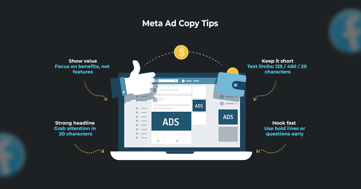
A great ad isn’t just about visuals — your words matter too.
But with Meta, space is limited… so every word has to work.
Here’s how to write copy that fits, flows, converts — without getting cut off and knowing that how much text is too much.
Keep your copy tight and clear:
· Primary Text (above the “See More”): 125 characters
· Body (after clicking “See More”): 250–450 characters
· Headline: Max 20 characters
· Link Description: Max 20 characters
Total headline + link description = 40 characters
Pro tip: Make the first line count. That’s what gets them to stop scrolling.
This is the first area that people see.
This is the text that shows before the “See More” button — and it needs to hook attention fast. Its character limit should be up to 125 characters. You can make it count by:
· Asking a question
· Saying something bold
· Hinting at a benefit or problem
· Using emojis if it fits your brand
Example:
Want 3x more leads without raising your ad spend?
Once someone clicks “See More,” they’ll see your full message. This is where you explain your offer or tell a short story. Its character range is usually 250–450 characters. You can use this space to:
· Share key details
· Add proof or results
· Show benefits, not just features
· Include a soft Meta CTA
Example:
We helped 400+ businesses scale with smarter ad targeting — no guesswork, just results. Our new AI-powered strategy builder gives you instant insights to stop wasting budget. Ready to launch better ads?
This text appears next to the Meta CTA button — keep it simple and direct. Under 160 characters can be used for it.
Examples:
· Sign up to get instant access
· Book your free strategy call
· Try it free — no credit card needed
· Learn how it works in 30 seconds
This appears as the main title under your ad. It’s written big and bold under Image/Video. It should grab attention in just a few words. The Character limit for this is 20 characters. Try to keep it short and strong by:
· Using Power words
· Sparking curiosity or highlight value
Examples:
· Boost Sales Fast
· AI Ads That Work
· Get More Clients Now
This is the tiny, small text below your headline — often overlooked, but useful for a second hook. The Character limit is 20 characters.
Examples:
· Try the demo now
· Built for small teams
· Works with your CRM
Total for Headline + Description: 40 characters max
Meta users scroll fast — so your copy needs to be:
· Easy to scan
· Focused on benefits
· Light on fluff
· Written like a real person is speaking
When in doubt: Be clear, not clever.
Now you’ve got the full lowdown on Meta ad sizes, safe zones, and copy limits — the stuff that often gets ignored, but makes or breaks a good ad.
Designing ads that fit Meta’s platform isn’t just about avoiding mistakes — it’s about making sure your message lands where it’s meant to. No hidden CTAs. No blocked headlines. Just clean, scroll-stopping creative.
· Stick to the right specs
· Respect the safe zones
· Write copy that’s short, clear, and punchy
Your ads (and your results) will thank you!
Globalization has made the classrooms borderless; it has connected minds from all over the world and has allowed the students to learn from diverse cultures and ideas. The global education alliance has made the education process more dynamic and is preparing the students for the future where the learners need to think globally while keeping their local roots in mind.
"In an era of globalization, education is not just a local passport, it’s a global one."
(Gordon Brown, UN Special Envoy for Global Education)
This quote highlights the growing importance of international collaboration in education, reinforcing the value of global education alliance in preparing students to thrive in this interconnected world.
International collaborations in the academic sector help students to understand global cultures, help them connect with international students and professionals, promote innovation through diverse insights, and cross border cooperation, opens opportunities for students. Global education alliances provide students with access to a wide range of perspectives and industry practices.

This vision of global education alliance is clearly reflected in the recent international collaboration between UNESA’s Faculty of Language and Arts (DKV Program) and Identify Brand Deployment Agency, Canada.
"In an era of globalization, education is not just a local passport, it’s a global one."
(Gordon Brown, UN Special Envoy for Global Education)
This quote highlights the growing importance of international collaboration in education, reinforcing the value of global education alliance in preparing students to thrive in this interconnected world.
International collaborations in the academic sector help students to understand global cultures, help them connect with international students and professionals, promote innovation through diverse insights, and cross border cooperation, opens opportunities for students. Global education alliances provide students with access to a wide range of perspectives and industry practices.
This vision of global education alliance is clearly reflected in the recent international collaboration between UNESA’s Faculty of Language and Arts (DKV Program) and Identify Brand Deployment Agency, Canada.
This collaboration will open doors for joint research, internships, and cross-border creative projects. These opportunities will help students and faculty to engage in meaningful global collaboration, exchange ideas, and contribute to innovative design solutions with real-world impact.


This international collaboration is much more than a creative industry partnership. It represents a futuristic approach towards education that bridges academics with real world needs.
If we look from the perspective of students, it provides them with direct access to international professionals, real world practices, and exposure to global creativity standards. They gain knowledge about how design functions across different cultures, and they get knowledge about how innovation in visual communication is also bound to global relevance along with local context.
From the perspective of faculty and researchers, this international collaboration opens doors for collaborative research, enrichment of the curriculum, and allows them to interact with international peers.
This creative industry partnership is unique and powerful because it connects the highly evolving and innovative creative industry with the education sector. The importance of this partnership was emphasized by Dr. Syafi’ul Anam, Dean of the Faculty of Language and Arts at UNESA:
We hope this partnership opens new avenues for students to learn directly from global professional practices, enabling them to create design works that are both competitive and deeply rooted in Indonesian character.
This international collaboration is much more than a creative industry partnership. It represents a futuristic approach towards education that bridges academics with real world needs.
If we look from the perspective of students, it provides them with direct access to international professionals, real world practices, and exposure to global creativity standards. They gain knowledge about how design functions across different cultures, and they get knowledge about how innovation in visual communication is also bound to global relevance along with local context.
From the perspective of faculty and researchers, this international collaboration opens doors for collaborative research, enrichment of the curriculum, and allows them to interact with international peers.
This creative industry partnership is unique and powerful because it connects the highly evolving and innovative creative industry with the education sector. The importance of this partnership was emphasized by Dr. Syafi’ul Anam, Dean of the Faculty of Language and Arts at UNESA:
"We hope this partnership opens new avenues for students to learn directly from global professional practices, enabling them to create design works that are both competitive and deeply rooted in Indonesian character."
The world we live in is very fast paced and has truly become interconnected as we have heard throughout our lives that this world is a global village. And in this era, design is not just about creating appealing visuals; it has become more about solving problems across language, cultures and behavior of people. This makes this global education alliance between UNESA and Identify Brand Deployment Agency an important step and a futuristic approach in design education.
This international collaboration will help future designers to understand how design thinking is evolving on a global scale. Students will not just learn to use design tools; they will learn how to think critically about brand identity, cultural symbolism, user experience, and technological trends like AI in design workflows.
This initiative will also aspire the authorities to introduce changes in curriculum that will include the real-world challenges into the classrooms and will allow the students to work on them based on international market demands and in the longer run this would be beneficial as it will improve their local position in the world.

This international collaboration between UNESA’s Faculty of Language and Arts and Canada’s Identify Brand Deployment Agency is much more than a milestone; it is a signal toward building a new generation of creative professionals who can navigate and shape the global design landscape. This collaboration will serve as a bridge between academic learning and international industry practices. It empowers the students to grow culturally grounded and globally competitive.
This partnership has laid the groundwork for exciting opportunities ahead from joint research and global internships to creative knowledge exchange. It will help UNESA to grow its international presence, and this global education alliance will support its mission to equip students not just for today’s creative world, but for a future shaped by global connections and constant innovation.


.png)